Tuesday, 10 January 2012

In what ways does your media product use, develop or challenge forms and conventions of real media products?

Our music video contains many forms and conventions of current styles and media products. Our target audience is of those who listen to heavy metal and wear dark clothes. Society would call them Punks.


The whole music video is in black and white, which conveys the message that it is on old recording and gives the effect of being a horror video. We contrasted our music video to make the dark levels stand out more therefore giving horror conottations.

This screenshot from our video shows the dark clothing and the suit and tie that correlate to horror films and usually are worn by the scary villan in most action/horror films and also shows how the contrast has been applied to take the light out of the shot and set the scene.


Other Artists wear suits for there costumes in music videos like this screenshot from Good Charlottes video 'lifestyles of the rich and the famous'.


I our music video we tried really hard to fit as many codes and contentions in as possible of our chosen genre. They are codes and contentions because they work well and are popular. If we could use these well and pull them off then we knew that our video would be great.

The story line in our video was not one that you would find in a love song or pop song. The character gets kidnapped and hurt. This use of force and violence is a common convention in the metal genre and style of music we are using.


Our video uses masks. Masks are commonly used to hide identity and therefore create a sense of bieng uncomfortable for the audience. This works in metal genres because the idea being the band is to be scary and taken seriously. This common metal convention is used in the band slipknot. Here is a caption of them.


The ones with the masks in the music industry are seen as the villains. Slipknot work of this. The people who like them find them different and therefore are making a statement about themselves. We used this in our video because the bad guys are wearing the masks. We twist this in the end of the video the find that the hero was actually one of them.


The lead singer in my video is pulling off the stage move in that looks like they are trying to hurt themselves. This gives the audience the idea that the band is mentally unstable and make them more interesting and make there look more intimidating.


The caption below uses this exact same convention of heavy metal bands. The band is called the gallows and they are also wearing suits. This style just gives off a sort of Mafia look that means im not to be messed with.


Saturday, 7 January 2012

Our magazine advert and analysis


Layout
The layout is quite in your face as it has a large mask that we used in the video. This is used in the magazine advert because the face invades the readers personal space. This gives the reader the incentive to find out more about the advert.
The reader is attached to the mask due to it being right in the centre of the screen. The lined texture around the mask is sort of hypnotic and entices the reader into the advert.

Font

Our digipak and music video are both in black and white. This is a style we carried on through all are media products. The font is in black and white to convey a dark and gloominess about the band. It shows the genre of music well. The font style also does this because of its bold and grainy effect that goes well with the effects we used in the video.
 Important things we wanted the reader to see we put in red. This is very eye catching compared to the rest of the advert.

Imagery

The mask holds the expression of sadness. This makes the reader interested in why the face is sad and attracts the reader to the advert. Also the expression is sad and sadness is commonly used in metal videos to make them seem serious.

Colour

We contrasted out the light levels so that the dark levels would stand out more. By doing this we made the image more vibrant and look similar to our music video. This effect makes the picture and video more cartoon like.


Digipak feedback

  NEW

 After useful feedback from my teacher He stated that that the digipak front cover did not fit in with the connotations and style of the rest of our media products.

What we did was change the digipak from the one below to the current one posted on my blog.
He said that the font fitted in with the style so we kept that and the black and white style that is apparent in all our media products. The mask has been something that has is a trademark for my media products. It was apparent that this had to be the focus of the front cover. After a bit of work on photoshop our new front cover has been created.


OLD
Add caption

Our Digipak


Thursday, 5 January 2012

OUR MUSIC VIDEO!!!!

Our video is finally complete. We had allot of fun creating it but we are glad it is over because we started it before the other groups and ended it afterwards. That may be down to the rubbish computer. But we think its due to putting the most attention to detail into it.
ENJOY :)

Wednesday, 2 November 2011

How shooting went

What went well


The village hall location was great. It had everything we needed to create the scenes we wanted and they came out great especially due to the foggy weather that gave to cold winter effect that you can really see when we are editing. The house scene at the end was filmed in our friends house who kindly let us use it. The house contained the style we were looking for such as the old spiral staircase and the large mirrors on the walls.

The location was surrounded by farms. This lack of buildings gave the video the scary feeling of being alone and also the building attracted allot of crows that are known to be a significant asset in scary films.

What didn't go well 
Due to our bad organisation skills and rubbish sat-nav getting to this remote location was difficult and took longer than planned. This didn't give us as much time to film.

The camera that we were using seemed to be using a lot of battery power quickly. Luckily we found spares but  the camera ate through those as well. We managed to get the vital shots and they were exactly what we wanted.

Being winter it gets dark very quickly. This meant that the car scene didn't have enough light and it had to be filmed another day.

Conclusion


In conclusion we are very happy with how filming went. If we got to the location earlier we could have filmed it all in one day but this was fine because it gave us more time to plan the rest out. If the scenes got deleted by accident and we had to do it again what I would change is the camera we used. It didn't fit on the tripod very well and ate battery power fast. This made shooting that little bit harder. But overall a great result. Lets hope editing goes well.

Tuesday, 1 November 2011

Location


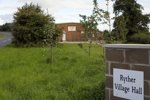
This is the location for the video. Ryther village hall. 38 Mill Lane Ryther Tadcaster LS24 9EG

The village hall really gives the music video the scary vibe that we where looking for. The hall is very far away from any other dwelling in the area. This will be made clear in our video because what we want is the audience to have a sense of fear while watching the video. This works well in other media productions like horror films and they attract a large audience. The location combined with the storyline and costumes should really give us the edge we need to create a great video.