Sunday, 29 January 2012

How did you use media technologies in the construction and research, planning and evaluation stages?

Throughout the project I used many different media technologies to create the final project.

Research

To find out about what the music video industry is like we used all sorts of technologies.

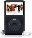
Youtube was used to find out the conventions of a particular genre of music that we wished to use. To pick the song that we wanted we also used technologies like MP3's and iPod s to find a song that we all agreed would be good to create a music video for.


We also created surveys on a website called survey monkey that stored our surveys on its website so that we could refer people via a internet link to the survey. This was much better than handing out the surveys by hand as we could save so much time and money as survey monkey is free. By posting the link on Facebook and twitter. This made the amount of people able to take the survey vast.


We also used a video camera to create interviews for people to answer questions about the particular music genre.
This was great because we learnt loads from the fans of the particular genre.


Planning


As one of our media products was a digipak. We created rough drafts out of card and paper before deciding on a final design to do on Adobe photoshop.


As using editing software such a premier pro and final cut pro are difficult to get the grasp of quickly we created a short movie trailer about a Zombie college to edit just like our music videos. That meant we knew how the software worked before getting straight into the editing of the music video.


Construction

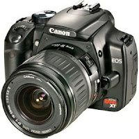
We used a digital SLR camera with a tripod to film. It wasn't ideal as it was designed to take photos and not video. It worked okay and the size meant that it was very easy to use.

There was no optical zoom so zoom was not used in our video. The sound quality is very poor on these. that was fine though because there is a song playing over the film.


After filming


We used the software Adobe Premier pro. This software was great and very ergonomic to use once you get the hang of it.

Here is some examples of effects and tools we used on premier

Cut- this helped us shorten the clips

Speed up- This meant that clips could be shorter and more dramatic and fast paced which is what you want in a metal video

Black and white effect- This made the video more of a old style look that gives the video a nicer feel.

What have you learned from your audience feedback?

I have summed up the feedback from my research on the interview post and the survey results post.

Here are the links.

Survey
http://tristanclarke.blogspot.co.uk/2012/01/survey-results.html


Interviews
http://tristanclarke.blogspot.co.uk/2012/01/interviews.html

Other feedback


Youtube


What we have learnt from the comments on our video is that we done a good job. We created a video that used and challenged conventions of the existing music industry to create a video the is as Ansel666666 says is 'brilliant guys'


We have also learnt that the video really does fit the codes and conventions of the metal genre. A survey about our music video was sent off to 12 people and found out those exact results.

Here it is.
  Copyright of Matthew Foster.


Friday, 13 January 2012

How effective is your combination of your main product and ancillary texts?

Adverts are released on purpose at chosen times so that they can all work to make a media hype about the product. This synergy of the media texts make the product well advertised and helps fans be informed and able to find and purchase the product.


We created three media texts in this project. A music video. A magazine advert and a digipak. They worked in synergy to make the product seen in many media forms. The music video will appear on t.v channels and internet video sites such as Youtube and Metacafe. The magazine advert will obviously appear in music magazines. The digipak will attract the audience in the shops when on sale. This synergy of media texts means that the product is well advertised before going on sale and that the media hype is huge.


The digipak was very useful because most music is downloaded from iTunes. This means that the front cover from the digipak is on show before sale and helps the song to stand out from all the rest.


In terms of imagery all the media text are the same. This similar look means that we have created are own style. This feat of originality is great because it means that the style can help to change the music industry. Just like Led-zepplin and the Beatles. The similar style helps the media texts combine and create an overall look that will be recognised.


The audience research helped massively before creating the media products. By knowing exactly what styles to follow to the exact detail of particular bands and videos we can use these conventions in our video. By then using our own origional ideas and combining them with existing ones we created products that would stand out enough to gain publicity. In the media business there is a term "bad publicity is better than no publicity" We used this concept in our products and wrote a new chapter in the music industry.


Tuesday, 10 January 2012

In what ways does your media product use, develop or challenge forms and conventions of real media products?

Our music video contains many forms and conventions of current styles and media products. Our target audience is of those who listen to heavy metal and wear dark clothes. Society would call them Punks.


The whole music video is in black and white, which conveys the message that it is on old recording and gives the effect of being a horror video. We contrasted our music video to make the dark levels stand out more therefore giving horror conottations.

This screenshot from our video shows the dark clothing and the suit and tie that correlate to horror films and usually are worn by the scary villan in most action/horror films and also shows how the contrast has been applied to take the light out of the shot and set the scene.


Other Artists wear suits for there costumes in music videos like this screenshot from Good Charlottes video 'lifestyles of the rich and the famous'.


I our music video we tried really hard to fit as many codes and contentions in as possible of our chosen genre. They are codes and contentions because they work well and are popular. If we could use these well and pull them off then we knew that our video would be great.

The story line in our video was not one that you would find in a love song or pop song. The character gets kidnapped and hurt. This use of force and violence is a common convention in the metal genre and style of music we are using.


Our video uses masks. Masks are commonly used to hide identity and therefore create a sense of bieng uncomfortable for the audience. This works in metal genres because the idea being the band is to be scary and taken seriously. This common metal convention is used in the band slipknot. Here is a caption of them.


The ones with the masks in the music industry are seen as the villains. Slipknot work of this. The people who like them find them different and therefore are making a statement about themselves. We used this in our video because the bad guys are wearing the masks. We twist this in the end of the video the find that the hero was actually one of them.


The lead singer in my video is pulling off the stage move in that looks like they are trying to hurt themselves. This gives the audience the idea that the band is mentally unstable and make them more interesting and make there look more intimidating.


The caption below uses this exact same convention of heavy metal bands. The band is called the gallows and they are also wearing suits. This style just gives off a sort of Mafia look that means im not to be messed with.


Saturday, 7 January 2012

Our magazine advert and analysis


Layout
The layout is quite in your face as it has a large mask that we used in the video. This is used in the magazine advert because the face invades the readers personal space. This gives the reader the incentive to find out more about the advert.
The reader is attached to the mask due to it being right in the centre of the screen. The lined texture around the mask is sort of hypnotic and entices the reader into the advert.

Font

Our digipak and music video are both in black and white. This is a style we carried on through all are media products. The font is in black and white to convey a dark and gloominess about the band. It shows the genre of music well. The font style also does this because of its bold and grainy effect that goes well with the effects we used in the video.
 Important things we wanted the reader to see we put in red. This is very eye catching compared to the rest of the advert.

Imagery

The mask holds the expression of sadness. This makes the reader interested in why the face is sad and attracts the reader to the advert. Also the expression is sad and sadness is commonly used in metal videos to make them seem serious.

Colour

We contrasted out the light levels so that the dark levels would stand out more. By doing this we made the image more vibrant and look similar to our music video. This effect makes the picture and video more cartoon like.


Digipak feedback

  NEW

 After useful feedback from my teacher He stated that that the digipak front cover did not fit in with the connotations and style of the rest of our media products.

What we did was change the digipak from the one below to the current one posted on my blog.
He said that the font fitted in with the style so we kept that and the black and white style that is apparent in all our media products. The mask has been something that has is a trademark for my media products. It was apparent that this had to be the focus of the front cover. After a bit of work on photoshop our new front cover has been created.


OLD
Add caption

Our Digipak